Moby Dick and Focal points

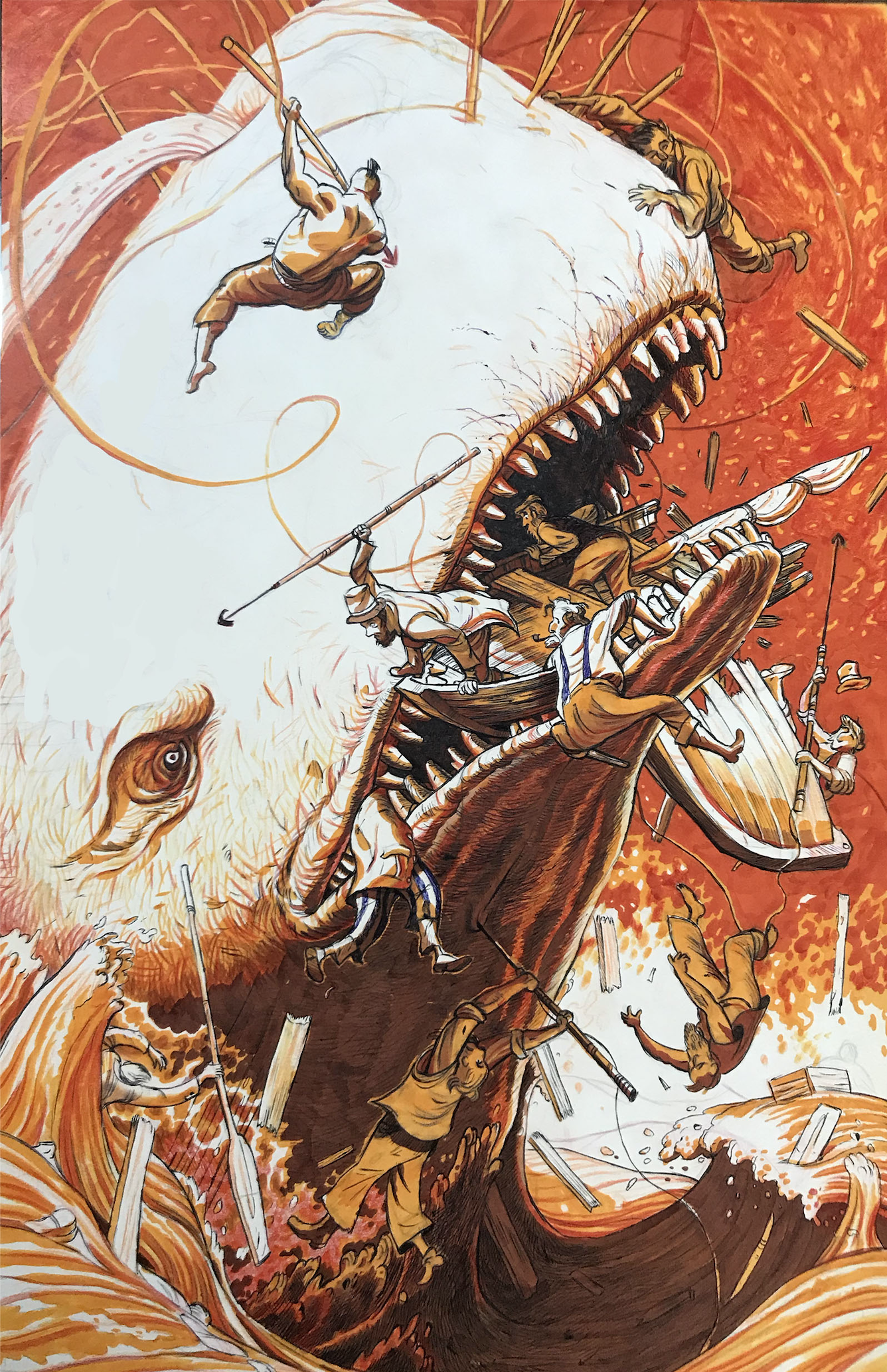
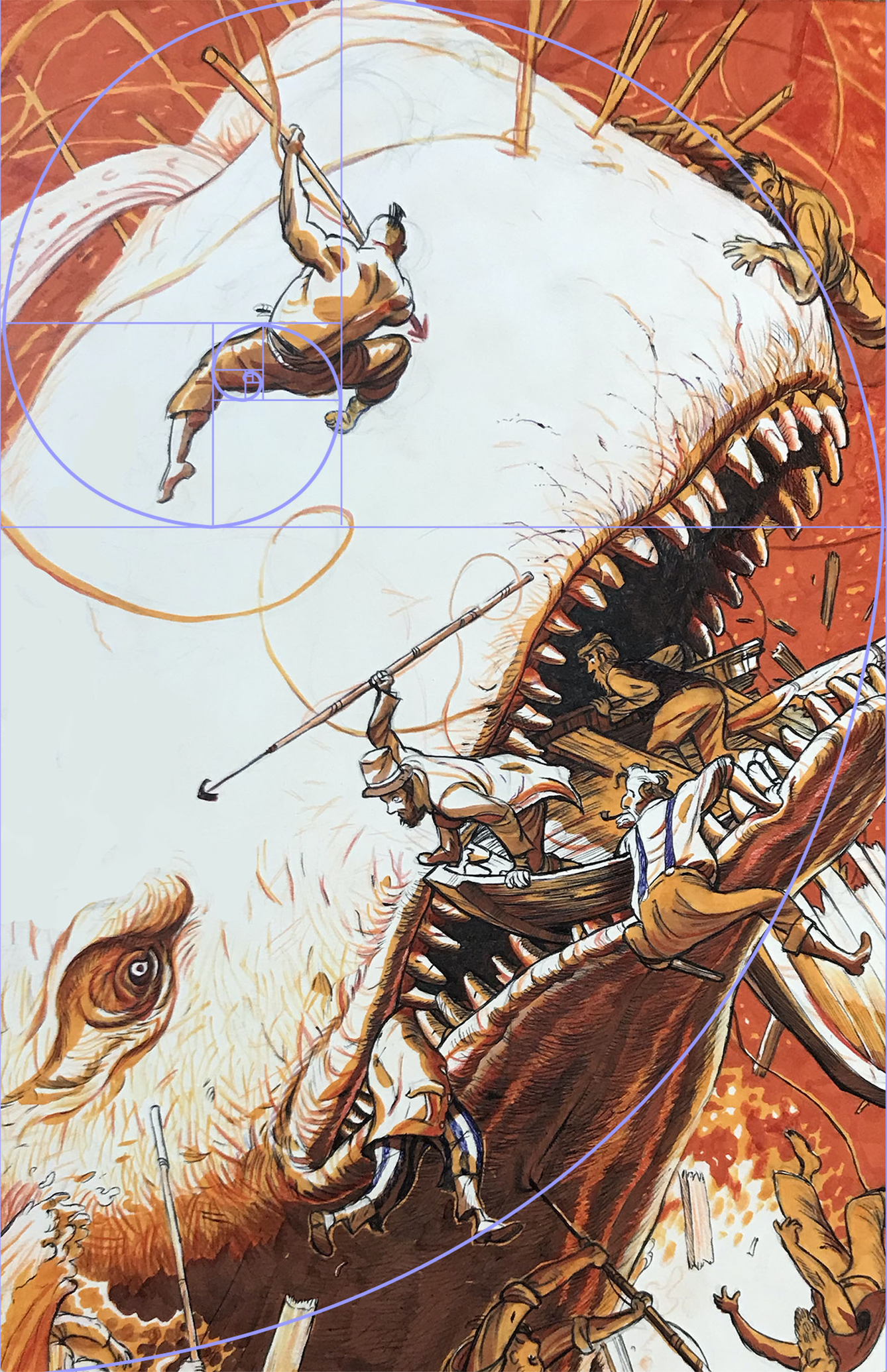
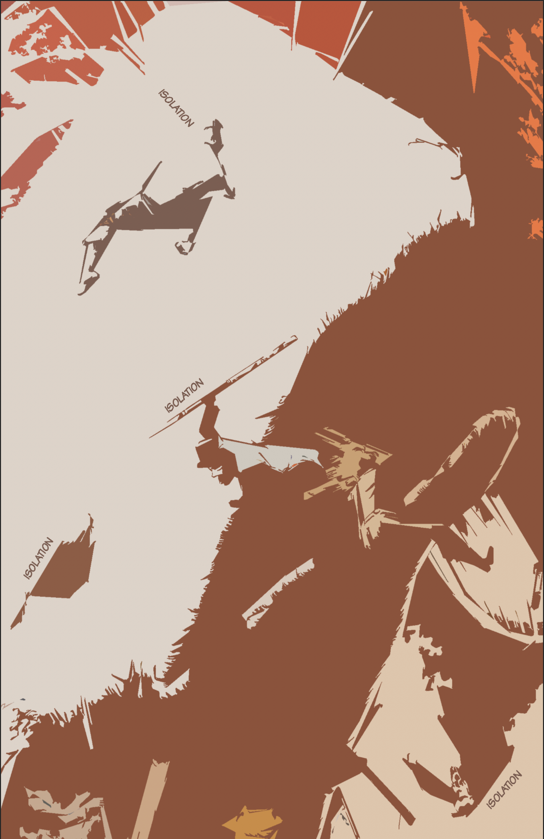
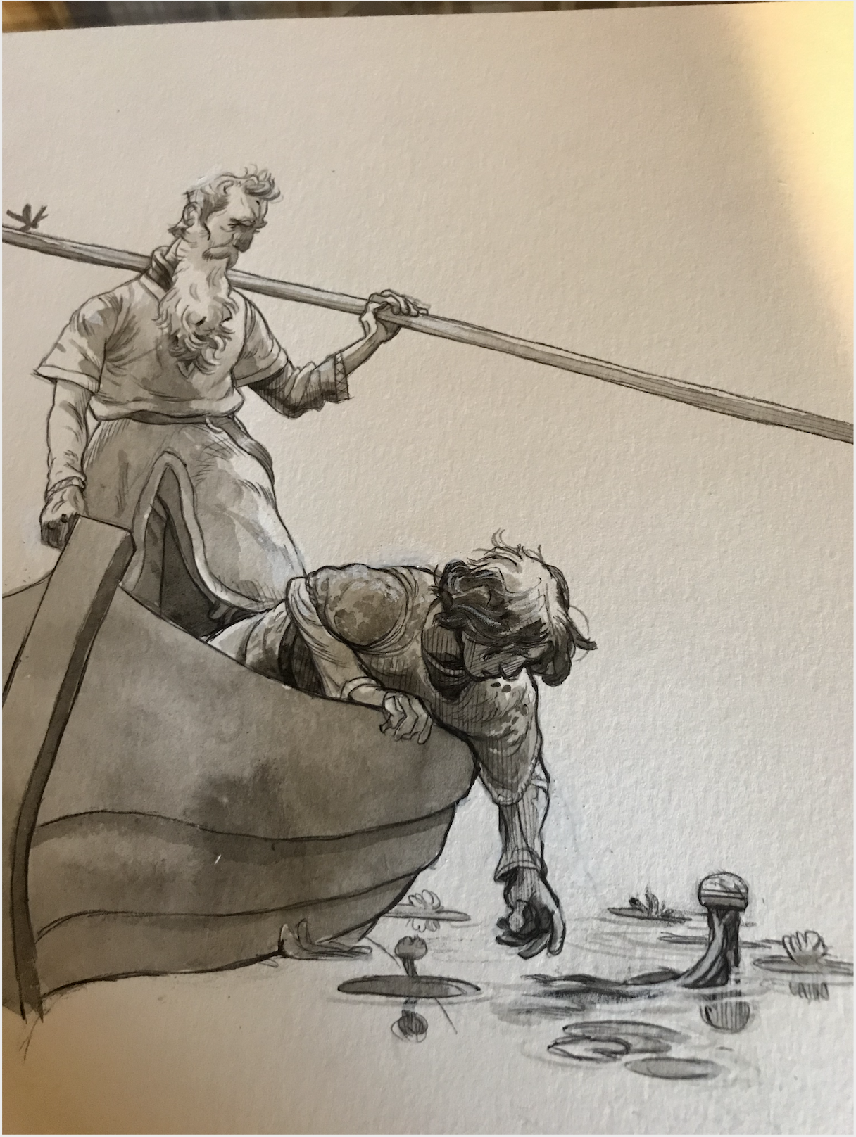
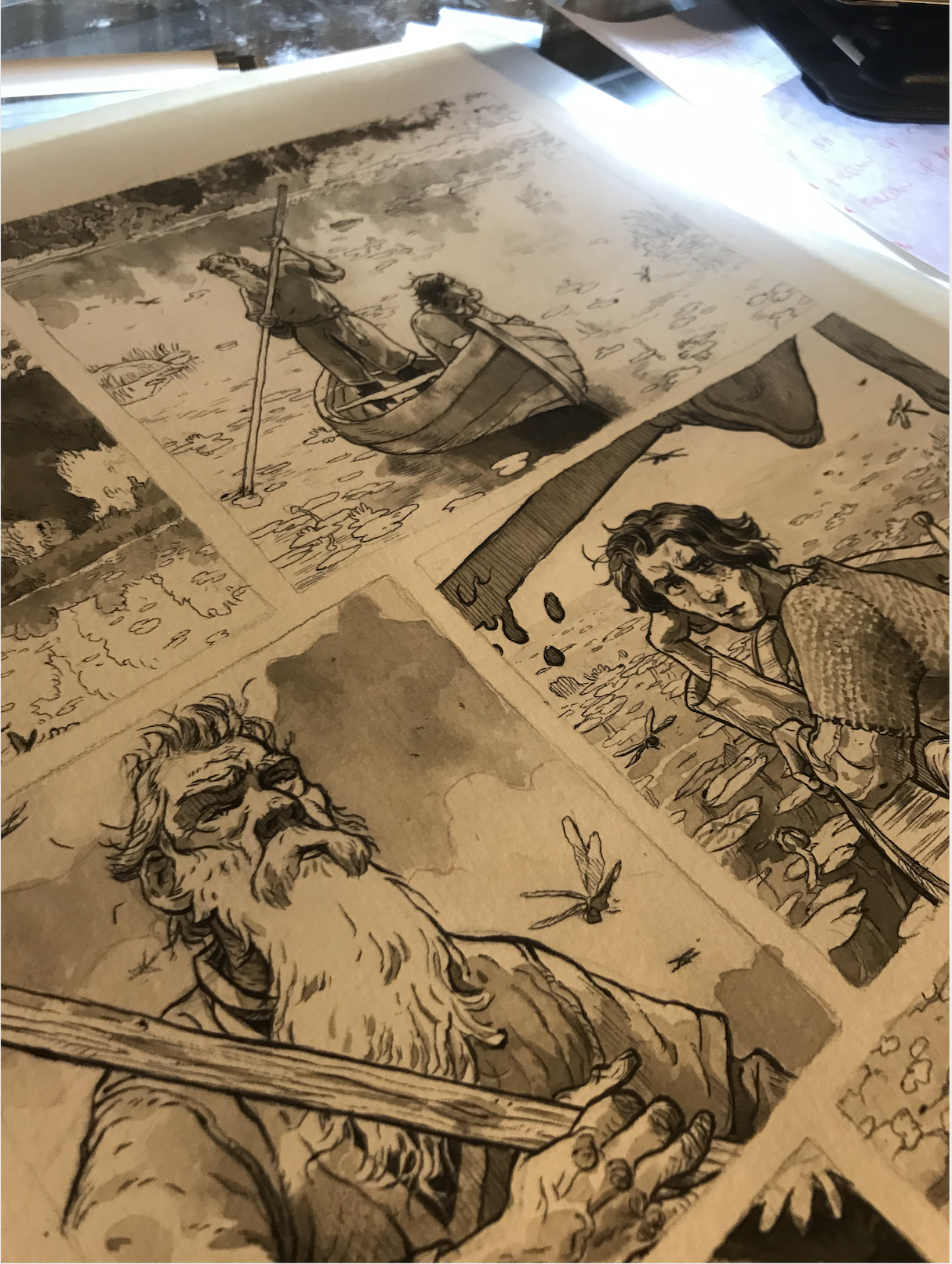
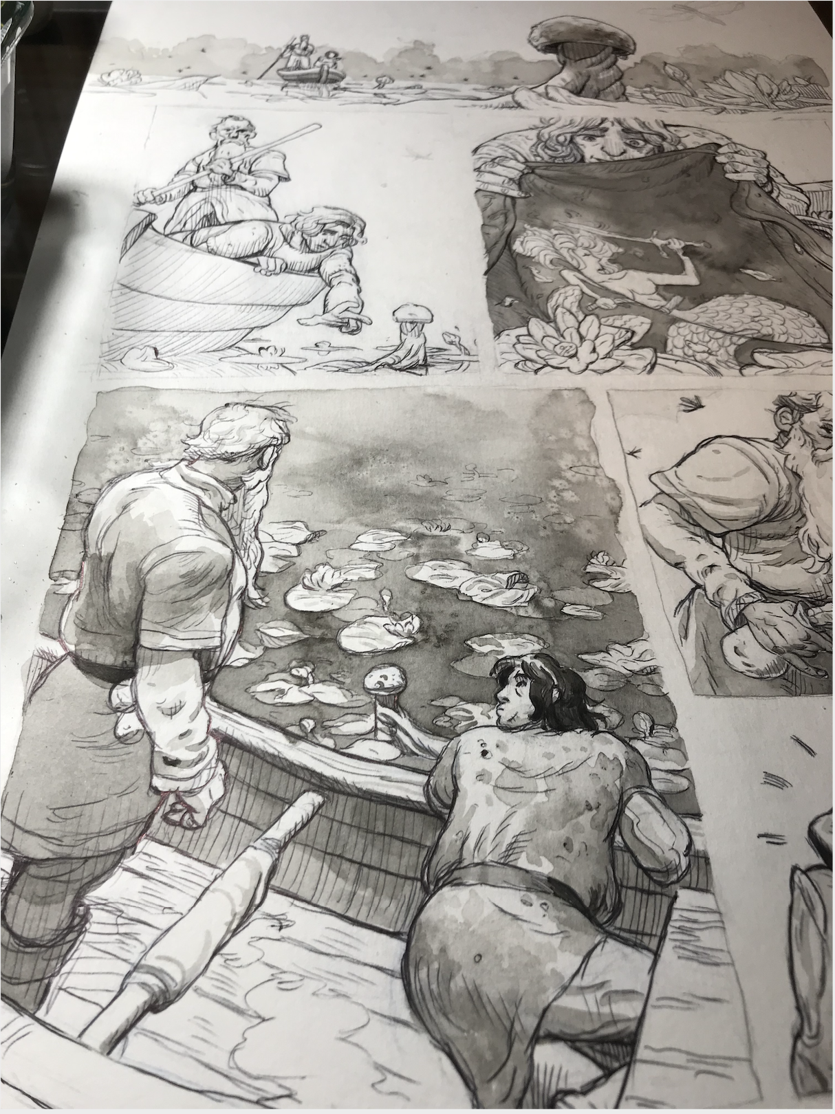
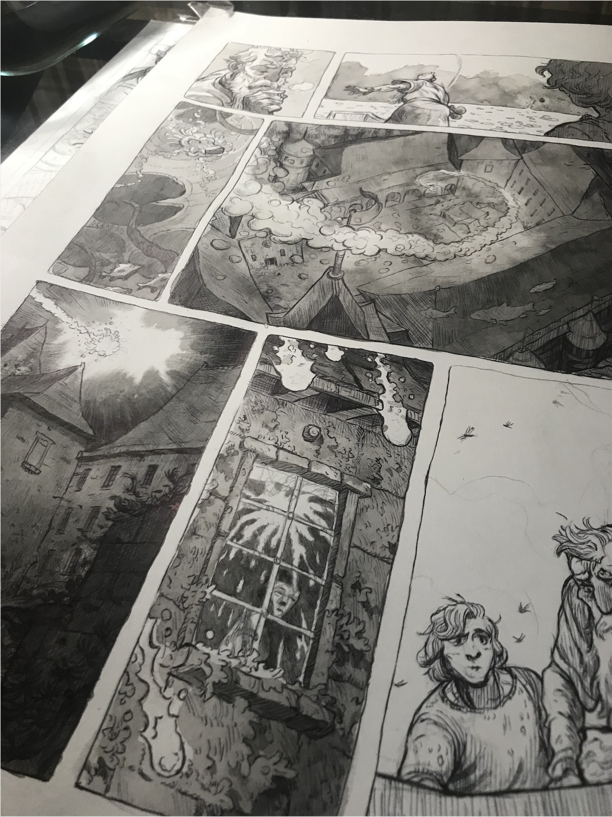
This Moby Dick illustration has been stuck in work flow purgatory (My bottom flat file drawer) for a long time. I started it with inspiration from John Hendrix’s The Worst of Times illustration series and it moved along well for a while but upon looking from a distance, it felt cluttered and unfocused. The difference I’m sure is that Mr. Hendrix probably had a game plan going into his compositions. I however approached this illustration with “ it would be sweet to squash a rowboat with whale teeth” and “It would be wild to show a fella leaping through the air towards a giant eye” etc. etc. Classic too many chefs in the kitchen scenario but my chefs happened to be stuff a whale just stomped on. Luckily I stumbled on Rob Levin’s article Focal Points at Medium.com. turns out I had lots of different focal points, each one rivaling the other. To clarify my narrative I ended up zooming in and omitting excess. This allowed the directional lines and the “isolation”(from the article) focal points to shine. Interestingly, if I move the crop and omit other figures, the diagonal lines and negative space become more evident. The filter Stamp in Photoshop is pretty helpful here to highlight directional line and those isolation focal points. Less is more apparently when it comes to highlighting whale destruction.

The Monster Project

Over the summer I was asked to help out with the Monster Project . For this fun activity I was challenged to interpret a student’s monster creation. Kellan, the great artist I was paired with drew an excellent kraken beast complete with treasure chest and sand castle. My take on this arguably near perfect monster was to introduce a diver into the mix and try to build a story about wanting to check out what was in that chest. For this piece I used microns and digital coloring.

119_Kellan.jpg
Screen Shot 2019-10-17 at 10.49.24 AM.png

Arthur and Merlin

A few months ago I stumbled across This Was Our Pact by Ryan Andrews and it was a revelation both stylistically and narratively. The story is wild and imaginative and a joy to read but as with most of the books I dog ear, the illustrations are memorable. In particular, Mr. Andrews uses texture and scale beautifully. There are moments within the layouts where the environment dwarfs our protagonists and becomes a character in its’ own right. Similarly, texture and line quality are used playfully throughout. One scene conveys a starry night sky with abstract circular pastel/chalk mark and in another, delicate thoughtful micron lines show encroaching fog. This Embracing of texture to convey mood is invigorating and after delving a bit deeper (The Iliad, Be Prepared, The Prince and the DressMaker, Fantasy Sports) I’m realizing the Young Adult graphic Narrative market is taking big bold storytelling risks.

I have always enjoyed showing process in my work (pencil under drawing, ink spatter with washes etc etc.) and This Was Our Pact gives a technical guide on how texture and process (when handled deftly) can add to a narrative. I’m trying my hand at this with a graphic novel pitch of my own, retelling Young Arthur and Merlin’s formulate years and burgeoning friendship. This project will be tackled with tactile tools such as ink wash, ballpoint pen, salt in washes and whatever else comes to mind to showcase the vacillating moods of the Arthurian world.

And a final colored, lettered page.

Screen Shot 2019-10-16 at 10.23.09 AM.png

ink and ballpoint pen work

Some Bond Vignettes in progress with India ink via Sumi brush and ballpoint. The finals will have these fellas in the foreground along with their most well known gadget in use behind them. Connery has to be the rocket pack, Craig maybe the car defibrillator?

Screen Shot 2019-08-22 at 11.40.30 AM.png

Mechanical Henchmen character Studies

This IPad Pro is a hoot! Specifically Clip Studio Pro and the iPad pencil. My concerns about the relatively small screen are unfounded because of the pretty good pinch/zoom function. For mechanical inspiration I’ve been looking at antique outboard boat engines which have great silhouettes and possess a really fun retro-futurist aesthetic

0.png

Hellboy and the Golden Spiral

Another texture heavy piece! Happier with this one I think due in large part to the addition of the Golden ratio as a guide for layouts. How does this differ from Rule of Thirds? Check out Jon Sparkman’s great article here on petapixel.com. In my experience it’s more illustration friendly as I prefer to place moments of interest along diagonal lines and the long looping arm of the spiral does just that while still placing important objects in similar coordinates to the Rule of Thirds. Interestingly, these ratios are both predominantly used in horizontal layouts..as I’m usually working vertically I’m curious if there is a vertical composition guide I’ve missed..

Next up, color schemes

Hellboy Golden Spiral.png

Head Lopper Fan Art Cover

Whew! It’s been awhile since my last post. I blame lots of cool big projects and toddler chaos. The end result being, this Head lopper mock cover is the first free time project I’ve had since October 2016. I’ll be writing a few longer process posts based on design principles etc.

For this piece I wanted to focus on a composition celebrating the Rule of Thirds. This handy tool for arranging elements in a composition isn’t on its face complicated, the rule states that as you divide your live area into thirds horizontally and vertically, those intersections where the perpendicular lines meet are natural focal points as the eye moves across the live area. In practice however, I found myself bending elements artificially to match those four found focal points that resulted in static oddly symmetrical layouts.

Enter the excellent Creative Bloq article written by Chris Legaspi. (Here). Through a pile of great examples, Mr. Legaspi showcases the importance of the vertical and horizontal lines as well those four intersecting points. Furthermore, He goes into great detail explaining it’s use to establish asymmetrical compositions. With this in mind I stacked my snakes along the left vertical and allowed our viking protagonist to occupy the right with lines showing the vertical snake’s mass and our viking’s interaction , Success? I’m not sure but definitely worthwhile messing with.

Up next, the Golden Spiral!

Screen Shot 2018-10-30 at 3.20.31 PM.png

Dead Bird Brewing's Titan Series

Recently I had the chance to collaborate with The excellent Wisconsin based brewery, Dead Bird Brewing. Their upcoming beer series Titans, imagines four new beers as monsters with characteristics inspired by the individual beer flavors. Reserve orders will be available for this poster at www.deadbirdbrewing.com. this November.


Skin Walker Ranch part 2!

For the second installment of Astonishing Legends Skin Walker Ranch episode, I tackled the half wolf, half man skin walker creature. In continuation of the mixed media approach to the first wolf illustration, I used india ink wash, and the Pentel brush pen but instead of the dry brush texture used previously, I tried Kyle Webster's halftone brushes.

A variant with a more human snout channeling the great Wolfman 

A variant with a more human snout channeling the great Wolfman


Skin Walkers Ranch illustration process

Astonishing Legends has a new podcast episode centering on supernatural sightings at Skin Walkers Ranch. ( Listen to it here) One of the cooler creatures to be seen multiple times on the ranch grounds was a huge wolf, described as blue eyed, gigantic and unaffected by gunfire. Because this was a quick turnaround, I focused on traditional media with more expressive line then stitched everything together digitally. 

The first image shows the wolf riddled with bullet holes. The second image describes the first sighting of the beast from the interior of a car. In the end the second idea was chosen to better show the scale of the animal.

The first image shows the wolf riddled with bullet holes. The second image describes the first sighting of the beast from the interior of a car. In the end the second idea was chosen to better show the scale of the animal.

When inking the wolf fur and car interior, I used a fresh Pentel brush pen for the contours and hard edges and a dry, almost empty Pentel to explore shading on the wolf and interior texture.

When inking the wolf fur and car interior, I used a fresh Pentel brush pen for the contours and hard edges and a dry, almost empty Pentel to explore shading on the wolf and interior texture.

For the background I used India ink to do a quick wash with the intention of this information being secondary and set back in space

For the background I used India ink to do a quick wash with the intention of this information being secondary and set back in space

Digital coloring with special attention paid to the wolf's described bright blue eyes.

Digital coloring with special attention paid to the wolf's described bright blue eyes.

Myths and Legends!

Here is a poster for the excellent podcast Myths and Legends. Because this podcast delves into a new character each week, the poster needed to showcase a group of legends which are commonly talked about. To listen to these podcasts and eventually buy this poster, visit Myths and Legends here.

Astonishing Legends!

Recently I was lucky enough to contribute to one of my favorite podcasts, Astonishing Legends! Below is an editorial piece centering around the harrowing tale of a young boy's struggle with the supernatural.

Portrait warmup

In between freelance projects I like to dig into the toolbox and fiddle around with forgotten media. Today I settled on color pencils and tried a self portrait. As an added change of pace, I kept away from chromatic colors and tried layering primary and secondary hues.. 

The Leo constellation

Recently I was asked to do a Leo illustration for an editorial piece. Here He is in all his surly glory

With the phases of the moon as an alternate

With the phases of the moon as an alternate

Character Design

Lately I've found myself working on big expansive black and white projects so this quick character design was a nice (colorful) change of pace

Little Red Riding Hood in Progress

 I've been pouring over the great Bernie Wrightson and his phenomenal Frankenstein illustrations. Here is my take on a fairy tale (in process) inspired by the creative size contrast shown in Mr. Wrightson's Frankenstein characters.